Chiaroscuro in Web Design: Masterclass with Thiago Costa
Building luxurious UI with classic art influences and state-of-art techniques
Supported by:
Framer: the best website builder for designers
Color AI: Generate meaningful color palettes with cultural references
Design Discipline Bookstore: designer books and accoutrements
Thiago Costa is co-founder of Fey, the financial research tool that makes professional investing insights accessible to all of us.
Fey is famous for high-quality visual and interaction design across all of its product and marketing touchpoints.
Adapted from his X threads, this masterclass with Thiago breaks down his process for building luxurious user interfaces with classic art influences and state-of-art techniques.
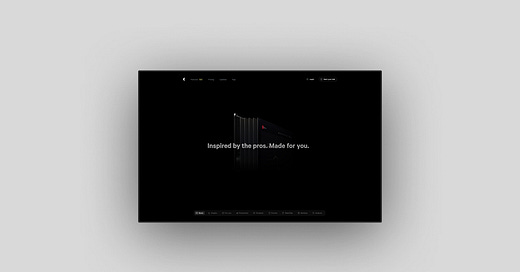
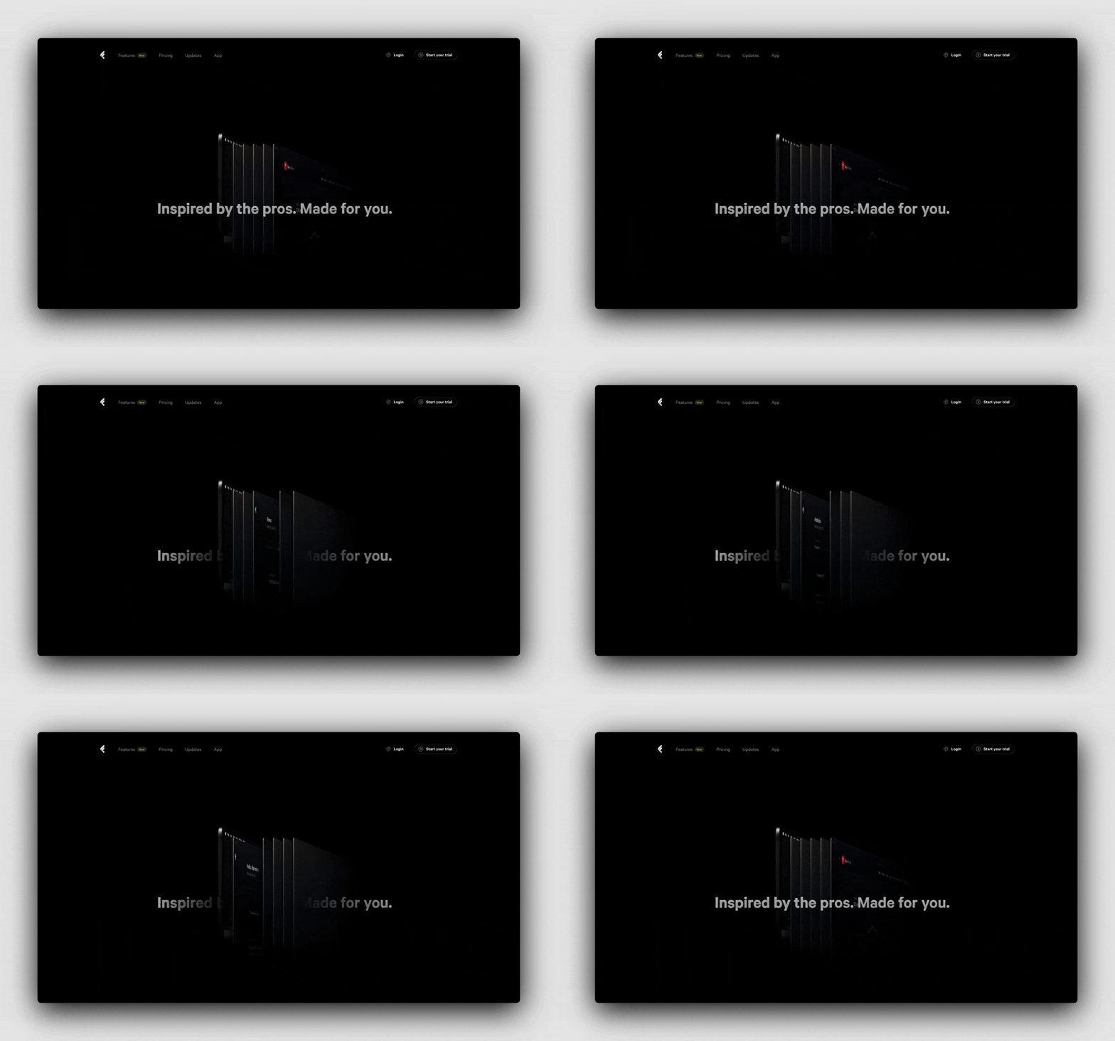
The recently launched Features page on Fey’s website is the perfect example to illustrate Thiago’s philosophy and technique.
We’ll follow his process for designing this page.
Concept
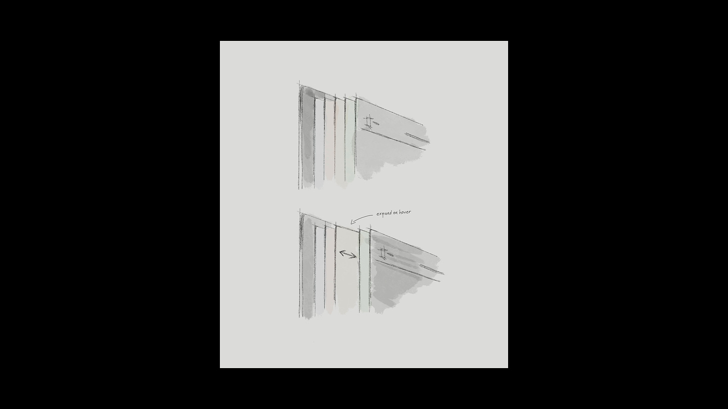
The dynamic interaction designs begin their lives as static sketches on pen and paper.
In the words of Office of Possibilities, our guests from episode 11: “Still, even though there's all these digital tools, the absolute best tool is pen and paper. There's no faster way of communicating an idea. [We] don't see how that will change, even as it becomes a digital pen… Having the speed to be able to do the survival of the fittest idea, to be able to do many ideas, and to be able to iterate… [Pen and paper] is the greatest.”
Aesthetics
Following the interaction concept, Thiago defines the aesthetics:
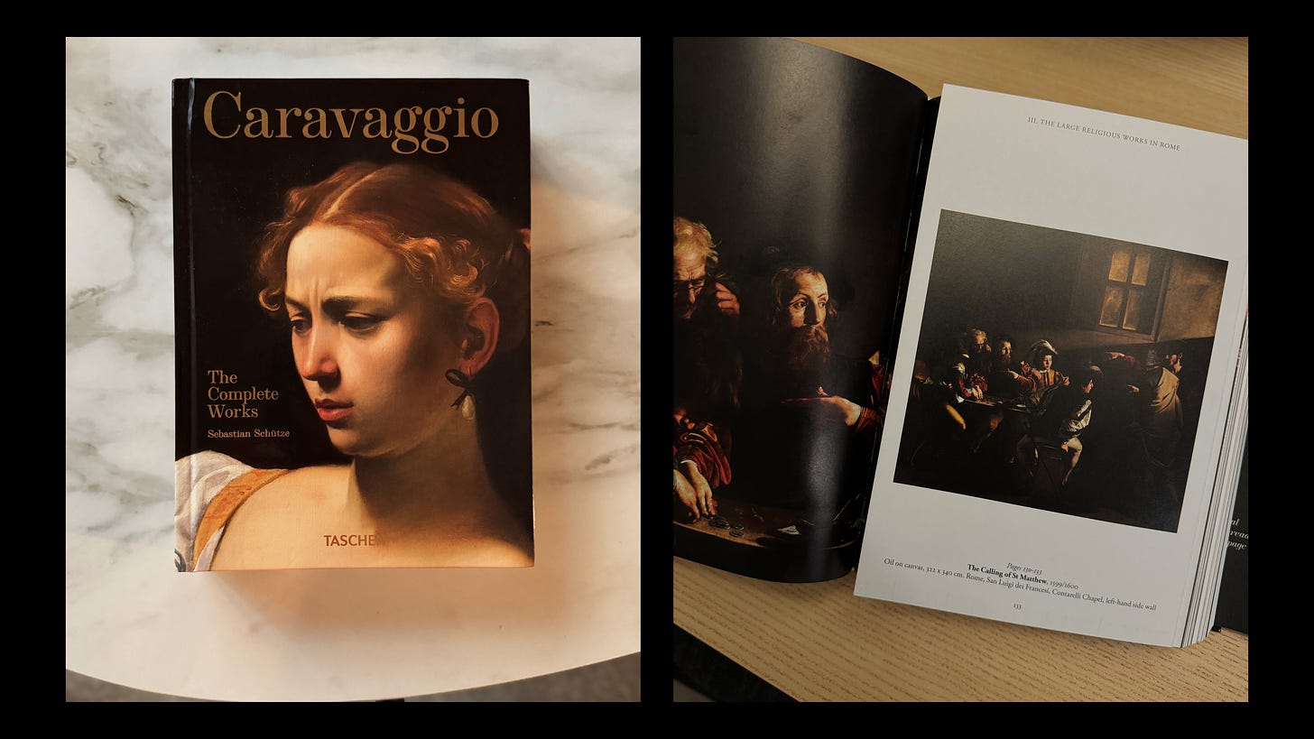
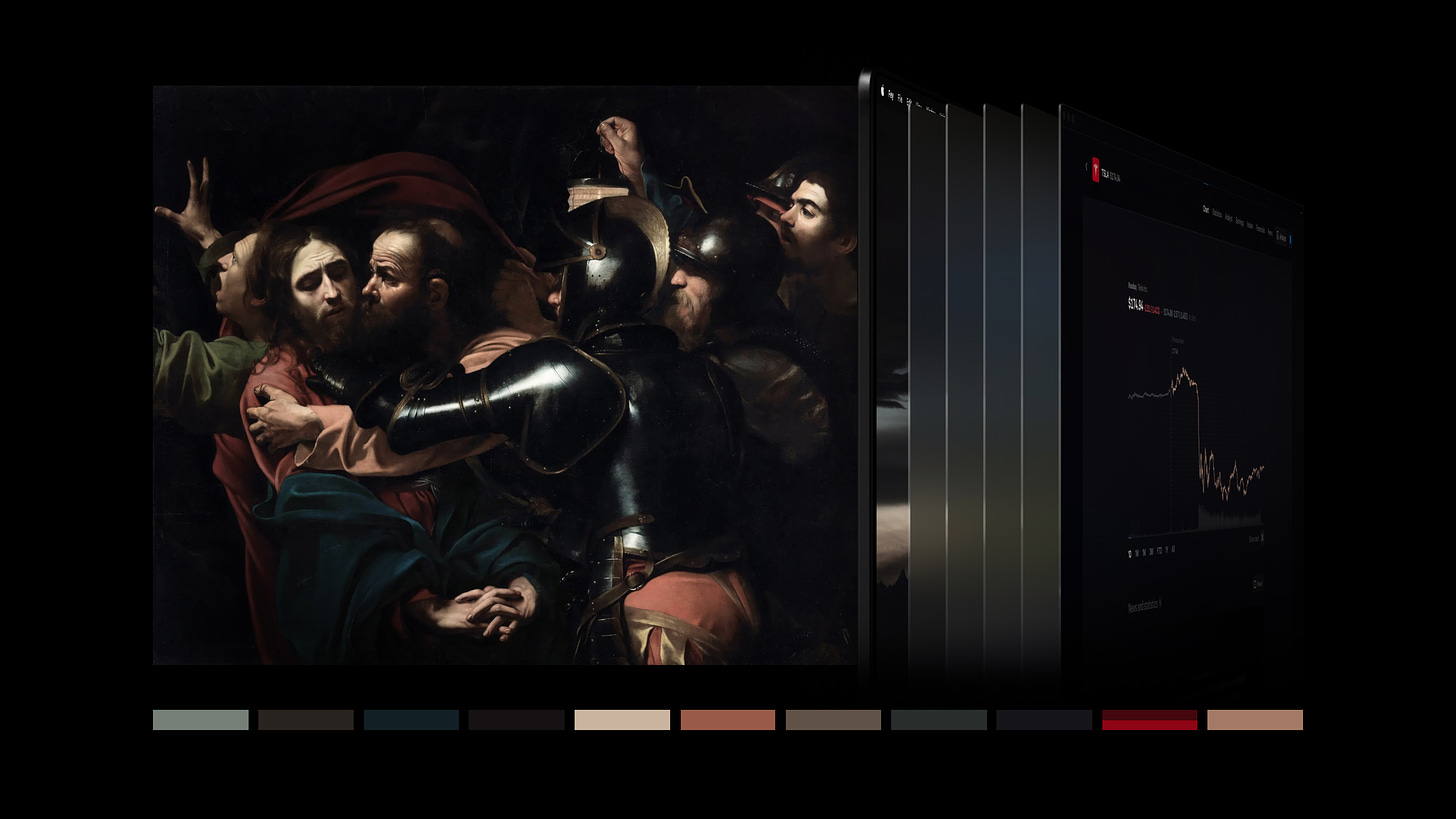
First, define the tone! I always try to experiment with Chiaroscuro, and for this I drew inspiration from Caravaggio’s paintings. The goal was to embody the dramatic interplay of light and shadow to set the mood right from the start.
Buy from Amazon — Caravaggio: The Complete works
Colors are subtle in Fey, yet chosen carefully to jointly evoke classic and contemporary references.
Chiaroscuro meant embracing deep shadows and stark contrasts, inspired by Baroque paintings. And the Tesla stock wasn’t randomly chosen, that’s a subtle hat tip to Caravaggio’s palette, that always included red details.
Realism informs Thiago’s design as much as art.
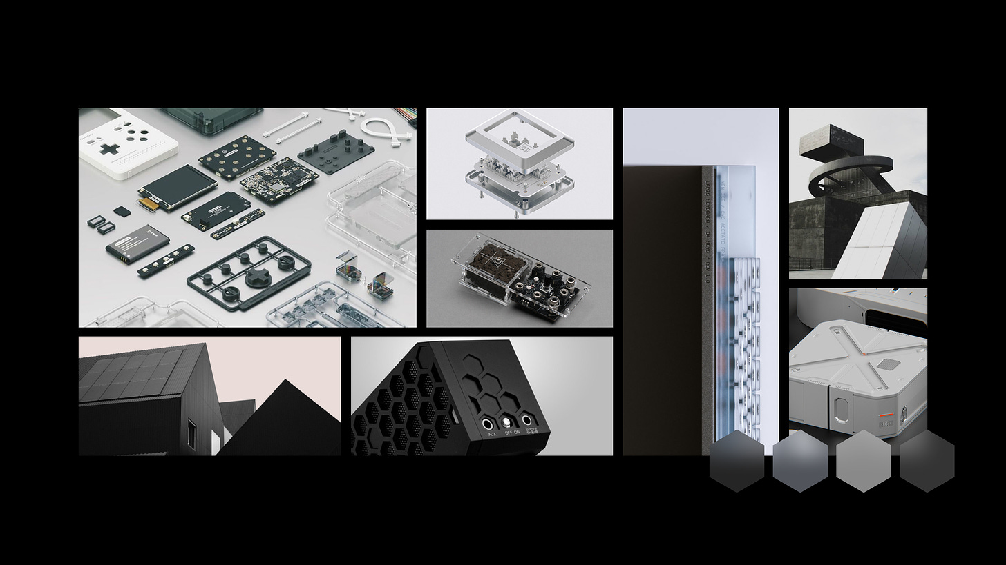
Referencing real-world object textures and lighting effects achieves a grounded, legible feel to the interface. Art influences and modern interaction design deter cliches of skeuomorphism.
Realism is a constant in Fey’s brand identity. Thiago references surface properties of Apple products, which are synonymous with quality:
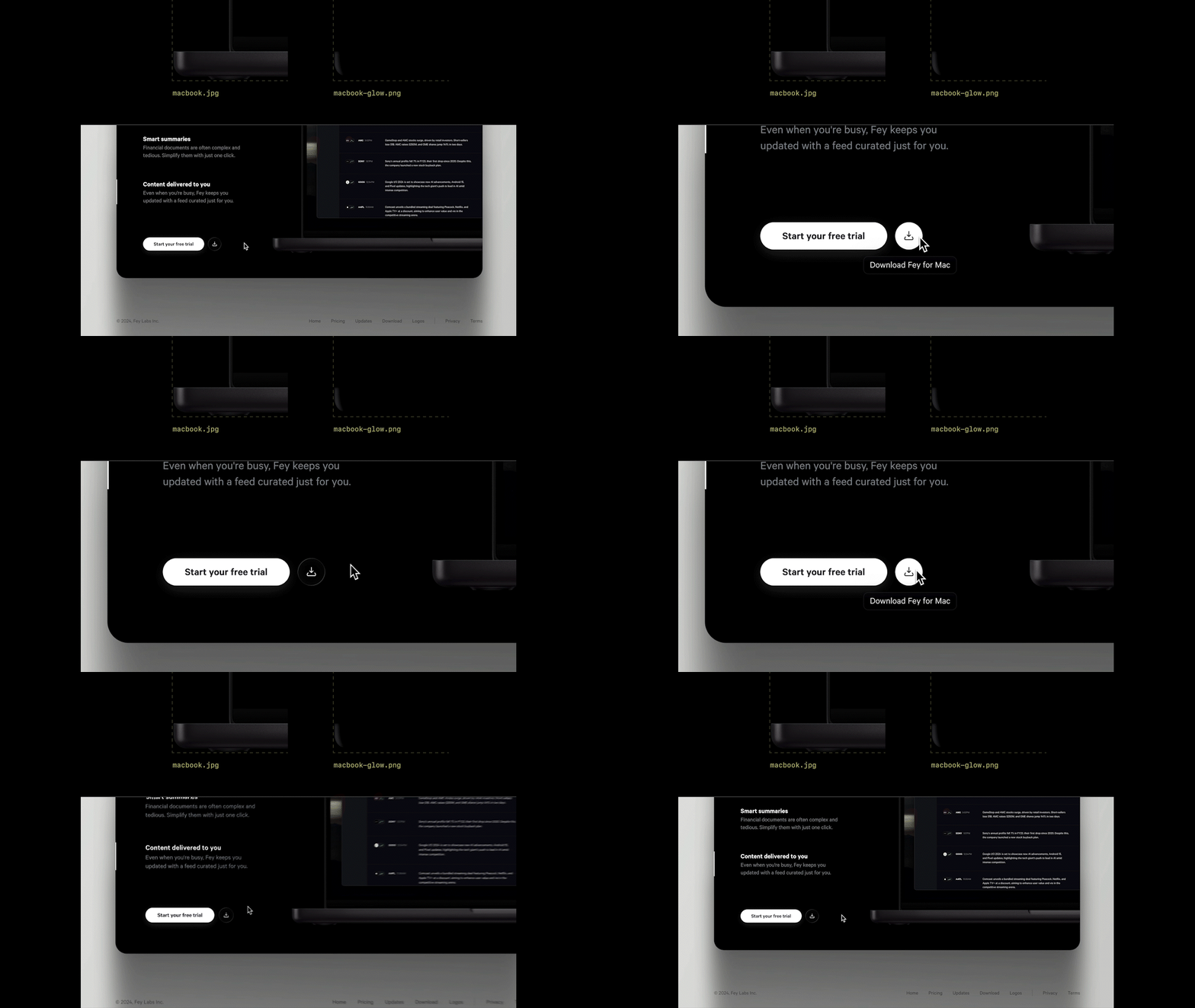
I can’t forget our signature touch: the laptop reflection. A simple trick with two images and adjustable opacity creates a cool reflection effect without too much complexity.
Technique
In web design, we build for devices with a vast range of screen qualities and performance. Powerful APIs for blur, transparency, and 3D are available, but may cause more pain than delight on less powerful devices.
Thiago knows the technical limitations, and how to conquer them:
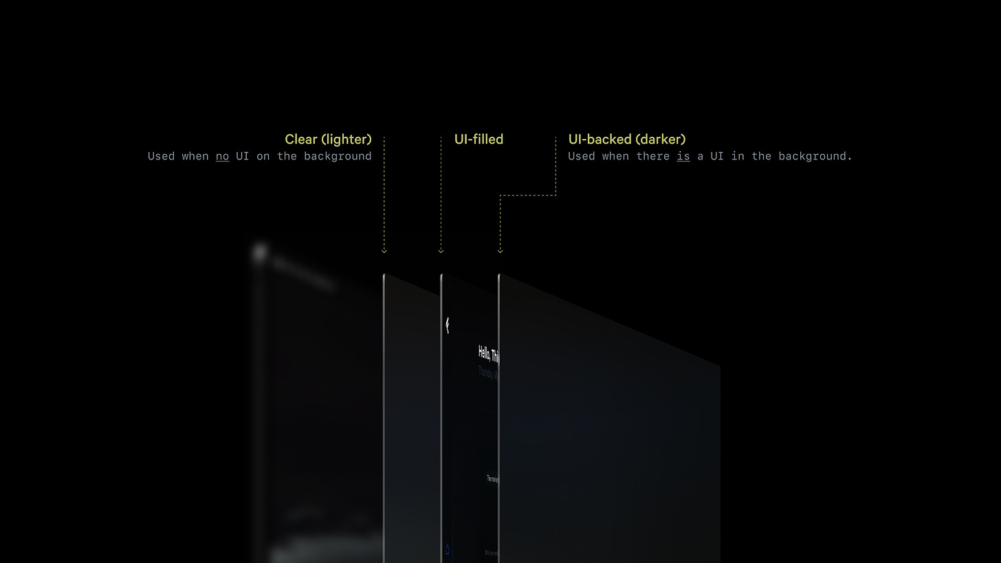
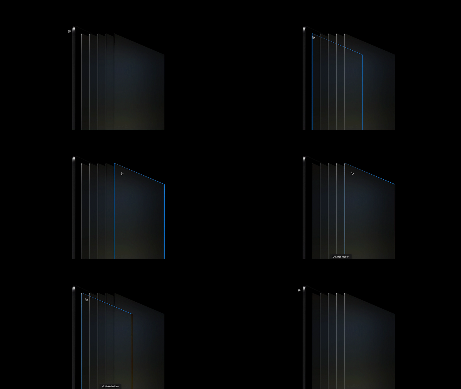
I faked [transparency] with three glass styles. It’s subtle, but apart from the UI-filled, there’s clear glass and a darker one to simulate the background blur.
And while 3D modeling is the default tool for designers seeking realism, Thiago prefers vector graphics for their look as much as technical optimality:
Choosing vector over 3D gives me more control in Figma, while infusing the asset with a personal, handmade quality. Hard to explain, but this usually results in a sharper but pleasantly “imprecise” feel that I really like.
Creativity
Testimonials, features, and benefits are mainstays in web design. They must exist on your website, but since they exist on every site, viewers may de-sensitize to this content.
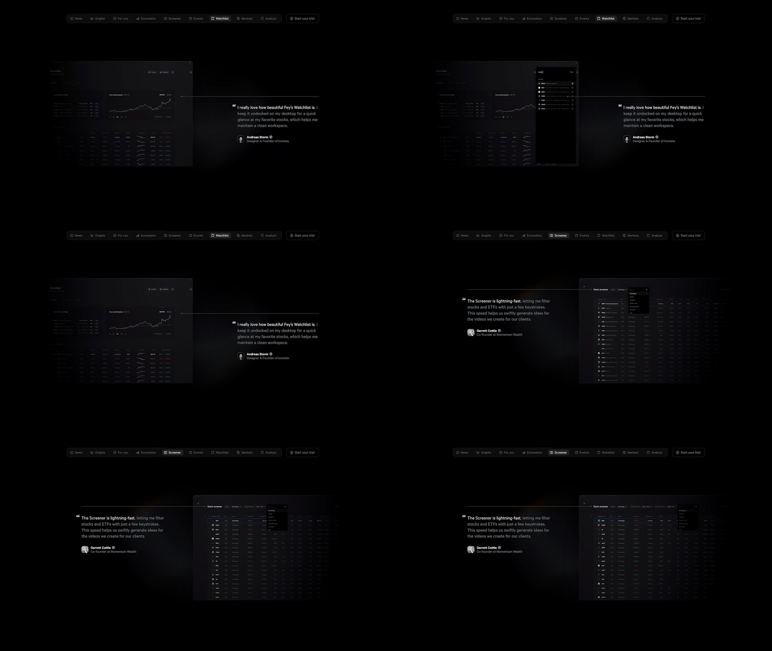
For testimonials, Thiago created an original interaction design, juxtaposing customer comments with animated demos of the app itself:
Each quote had to visually connect to the most relevant part of a feature, and I really wanted our customers to talk about them, rather than relying on traditional marketing copy.
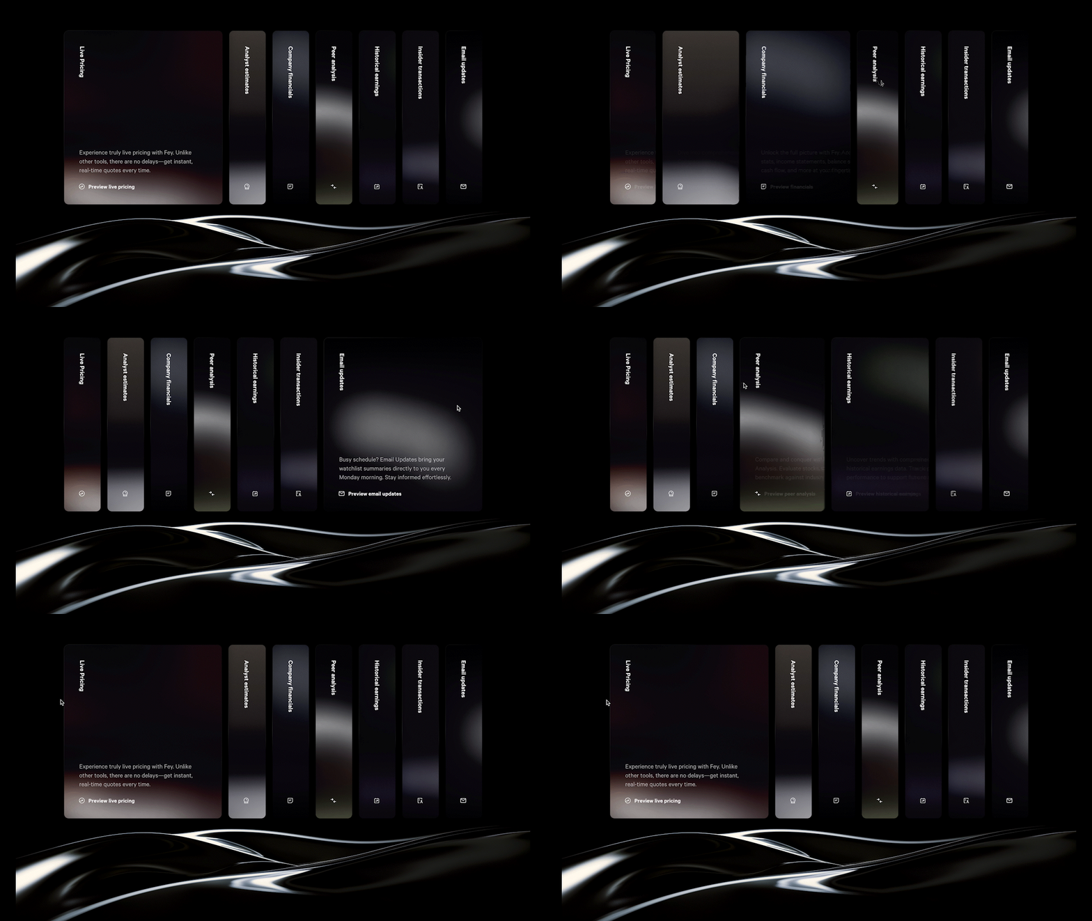
He deployed smooth collapsible cards to present a list of Fey’s features:
I aimed to showcase additional features without lengthening the page or creating yet another “bentos” section. And for a touch of movement, we added a subtle transparency behind the wave.
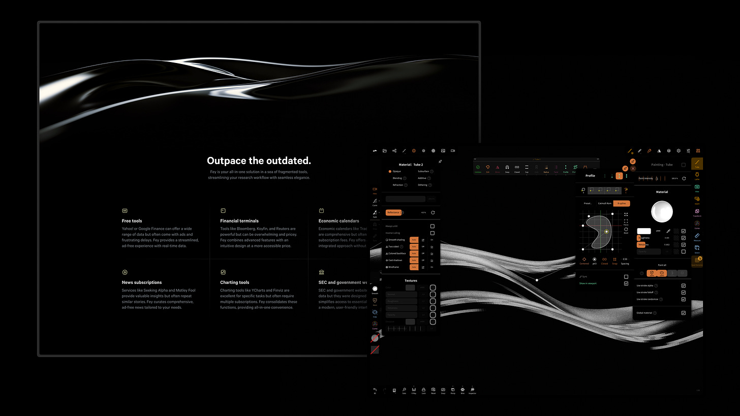
For the benefits section, Thiago crafted subtle visuals that reinforce the idea presented in writing, turning to 3D painting in Nomad Sculpt to create the best texture and lighting:
I wrote the next section before designing it, and the phrase “sea of tools” really stuck in my head. The story I wanted to tell was that the outdated tools were sinking, while Fey’s features are raised above the water. So I created this wave in Nomad to enhance the narrative.
Check out Fey at fey.com.
Follow @tcosta_co and @narative on X.


The level of detail is super inspiring.
Question: Would you consider this futuristic-all-black glassy-realism to be a trend?